Friday, June 13, 2014

A Lesson in Manners By: Kiel Torres

Babak Golkar: “TIME TO LET GO”
Vancouver Art Gallery – Offsite


When I think of terracotta, I think of strength: tiles of stability, roofs of protection, statues of preservation, and warriors of the afterlife. It can hold its own against the elements and withstand almost any form of manipulation, but it is weak in the face of gravity.
Like terracotta, we humans can attest to possessing a similar paradox. During stressful bouts, even the strongest can shatter.

Babak Golkar’s current installation at Offsite investigates this relationship between composure and vulnerability. Situated in Vancouver’s business district, Golkar invites the public to release their emotions into five terracotta vessels that have been designed to contain a scream. Surrounded by high-rise office towers and high-end business centres that house high-levels of stress, I could not imagine a more appropriate location for this installation.

With all of the pressures of senior year weighing me down, I could not wait to let it all go, yet when I arrived at the tranquil scene, I experienced quite a bit of hesitation. Each vessel was propped up on a stack of sandbags that were surrounded by a thin layer of water, creating a peaceful setting I did not want to disrupt. Although cars were whizzing by and snippets of overheard conversations polluted the air, everything just felt too quiet!

After having timidly stood at the edge of the site staring at the vessels for some time, I worked up the courage to let my lungs have their way. I stuck my head in and...AHHHHHhhhhhhhhhhh!???
It was awkward. I was expecting the roar of a lion, but instead I released the peep of a mouse. Why was this so difficult?

To put things into perspective, if you were to look up the antonym for “rebel”, my name would yield the first result. I was that kid in kinder-garden who was awarded the gold stars for never speaking out of turn and whispering in the library, and although I have certainly relaxed over the years, my goody-two-shoes character hasn’t shed completely. That being said, even when given permission to yell to my heart’s content, I was rather tentative.

Having been taught to use my “inside voice” through all of my childhood, I (un)learned a valuable lesson in social etiquette through Golkar’s piece: being fragile takes a fair bit of strength. By pushing the public to find comfort in the uncomfortable, Golkar has created a transparent form of therapy that leaves participants with an enlightened sense of self.

With my head emerged in the terracotta mouth, I stood in silence and allowed the external sounds to echo in the chamber. My breathing was amplified by the shape of the vessel, creating an ambient arrangement of inhales, exhales, and muffled city sounds. It was an overwhelming feeling of being entirely surrounded by yourself that cannot exactly be described, only experienced.

One of the things that really stood out to me about Golkar’s piece was the use of sound. I was really interested in how the sounds of the surrounding city became fused with the quiet thoughts inside my head while my face was buried in the vessel. The meditative quality of this experience served as inspiration for my exploratory piece. The following clip is comprised of a series of sounds collected from my bedroom, a place where I do a lot of my thinking.
During stressful times I often retreat into silence, creating a heightened sensitivity to noise. Sometimes even the tiniest rustle seems amplified, which can be REALLY distracting when I am trying to focus on something. But on the other hand, by allowing myself to be completely aware of surrounding sounds, I am able to mute my thoughts and in turn, let go of whatever is on my mind.


Tuesday, June 10, 2014

Couches in 108: A Group Exhibition


When tasked with creating an exhibition for the Point Gallery, we were given the theme of public engagement. Our goal was to get as many students as possible to come down to the Point Gallery and participate in our exhibition. When brainstorming ways of getting people to come to the gallery we thought of the couches in the library. Everyone always rushes to the couches and tries to get the best spot for themselves and their friends. For our show, we decided to explore this obsession by bringing couches down to the gallery...but our artistic process didn’t end here.
We were inspired by Vancouver artist Ken Lum’s piece Red Circle, in which he created a couch that challenged the convention and efficiency of furniture.


We liked the idea of the awkward couch that Lum used and decided to explore this concept of awkward-comfort.
We sourced four couches from around the school and each day, we arranged them in new unconventional positions that not only challenged how visitors interacted with the furniture, but also how they interacted with the people around them in accordance to how the couches were set up.


During each lunch period, we took photos of people interacting with the space and displayed them in a linear arrangement on the gallery wall. This created a timeline of sorts and served as documentary evidence of how the exhibit evolved each day, as well a method of creating intrigue. As the exhibition began to take off, we noticed that certain students returned to the space just to see if they were captured in the previous days’ round of photos.

Every day we noticed differences in how people responded to the exhibit: when there was more comfort and it was less awkward, more people came but didn’t understand that they were participating in an art intervention. When the couches were more awkward and less comfortable, less people came but those that did come understood the intention of the show.


The best set ups were when the couches were positioned in a way that was awkward, but didn’t impede on the conversations between people. The spiral pattern on Day 5, and the corner arrangement on Day 6 had the best mix of the two elements and drew the perfect crowd with a good size and mindset.


Over the course of our seven day exhibition, certain regulars started showing up but new people continued to arrive every day.
Our forms of advertisement included a Facebook page, where we posted daily photos and information about upcoming events, posters that we hung throughout the hall ways, and many announcements over the P.A. In our advertisements we concentrated solely on one phrase: “Couches in Room 108”. The repetition of this vague line conveyed what we were doing in its simplest form, but also sparked intrigue.
The show had certain aspects that made it a success and certain aspects that were failures. It was successful in the way that we got huge crowds down to the isolated room and made it known that the Point Gallery existed. On the other hand, the crowd that came to the gallery was dominated by Grade 12s who were only looking for somewhere to sit.
This conflict could also be partially attributed to the fact that prior to our exhibition, the majority of the student body was not aware that Room 108 was in fact an art gallery.
But it is understandable how this mistake could be made. From the checkered floors, to the frosted windows, to the chairs and tables stored in the space, the Point Gallery looks more like a retro storage room than a typical art gallery. It is far from being the typical “white cube” that people are used to. This led us to question how context plays a role in the outcome of interactive exhibitions. It would be interesting to recreate this experiment in a space where it was obvious that one shouldn’t interact with the couches and observe how the exchanges would modified.

Looking back at the exhibit there were certain things that could have been done differently to attract a more diverse crowd. Many of the younger students seemed to be intimidated by the Grade 12s and wouldn’t stay for long. There should have been signs showing people where Room 108 was actually located and we should have been more proactive about getting the younger grades to come to the gallery.

Overall, although Couches in Room 108 had its pitfalls, we learned a lot about collaboration and what it takes to put together an art exhibition. We would like to thank everyone who participated and supported our show, as well as Mr. Long, Mr. Enns, and Kirsten Hermanson for letting us borrow your couches.


-Aly Slobodov, Cosette Bote, Kevin McCallum, Kiel Torres

Tuesday, June 3, 2014

In Between: a Gallery Review by Nancy Tseng

Artist : David Burdeny


Title of show: Saudade 

Location: Jennifer Kostuik Gallery


At a first glance, Burdeny’s artworks look nothing more than simplistic parallel objects, or patterned landscapes. Then you ponder upon this simplicity. What is this? These are actually photographs? Where is this? How is this taken? The foggy background presents an ominous feeling, which almost numbs your senses. It offers a melancholy, wistful, and confusing atmosphere, which makes it that much more intriguing.

Burdeny’s purpose behind these photographs is this idea of Saudade: a Portuguese word referring to this desire for what was or what could be—to be someplace anywhere but the present. These photographs are supposed to represent a dream state where one floats above and wonders through, with no prescribed destination. Burdeny purposely objectifies his images, to create this feeling of being neither of this world, or another, but in between.

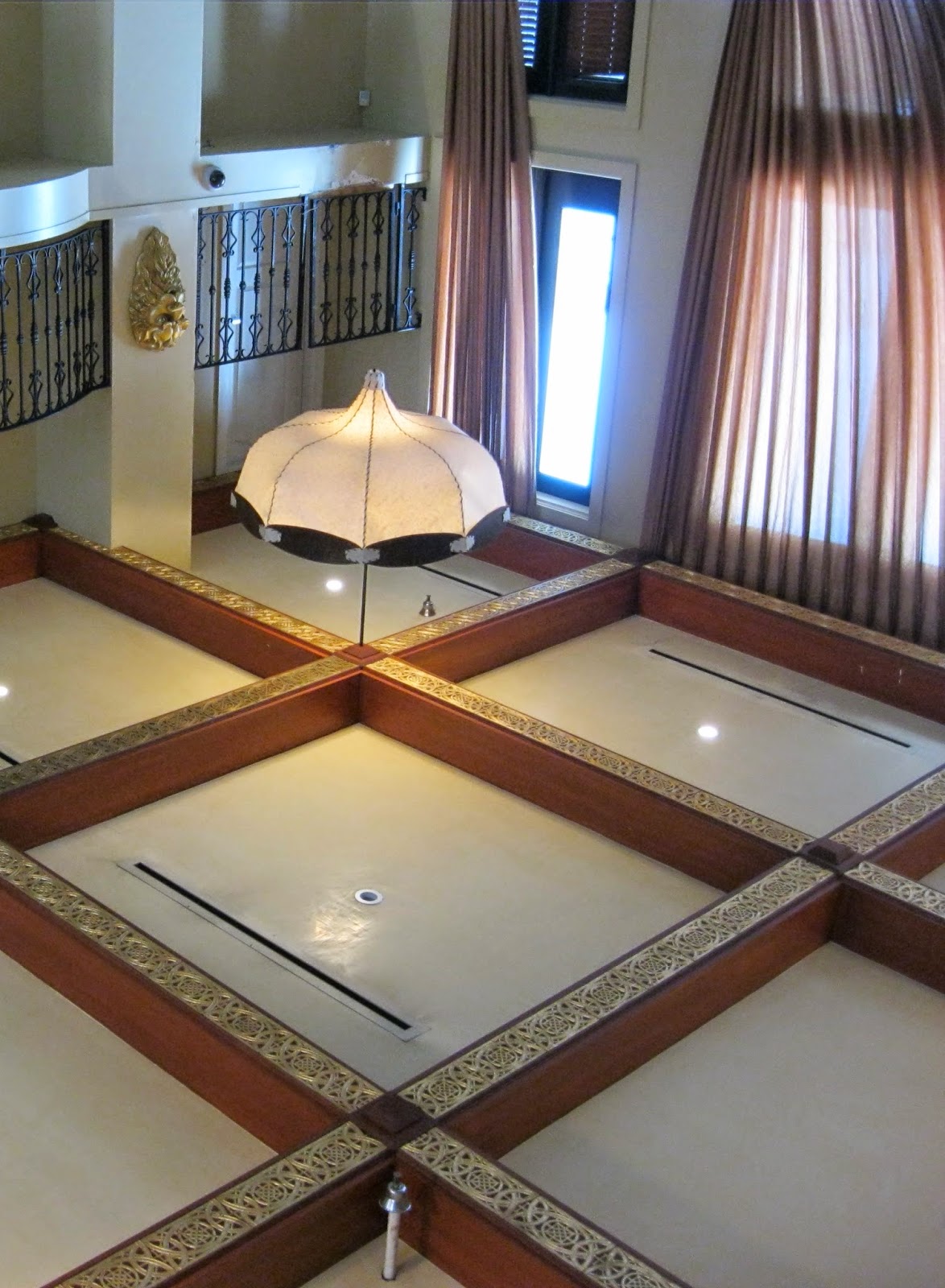
With this idea of objectifying images, and Burdeny’s use of parallel structure/pattern, I similarly took photos of architectural structures and landscapes. By playing with close-ups, and angles, I wanted to achieve Burdeny’s idea of Saudade, and create that dream state of floating in between worlds.